


The sign creation process
It isn't a simple task... Once you have provided me with a typeface / text style and provided a brief, there are a few steps involved in creating your sign
I begin by working out the scale (upsizing the typeface from a pre-prepared reference sheet) - which depending on the surface being painted on, it can be awkward... 25point letter size upscaled by two and a half times, it can get messy with millimetres. Often, this is done by eye, rather than ruler as it is more the visual impact and spacing that needs to work.
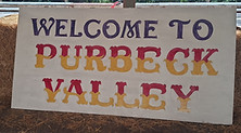
Using a recent commission for a great local salvage / vintage / collectables business, you can see here the process I go through to create your sign.

Having laid out the text, and then added a mark out for the block, begin painting.

For shapes that aren't square, work out where to 'line up' against, in this case the straight top of the saw.
line out and draw the lettering, spaced and rescaled by eye.
Adding any fancy illustration as needed.

To ensure consistency, do the 'same' letters at a time, to get as close a match as possible

Begin adding the block. I changed the initial idea of an equal but upward block on the second line, as I felt a thinner block on the opposite side worked better

Finally filling in the leaf motif with gold and some basic shadowing. It is not just to fill space, but add a bit more character to the sign.

I felt like something was missing, so added a gold hint of an in-line / flash to add more character.
This was an interesting commission as the saw was very old and incredibly pitted with rust. It took a lot of sanding back to get a relatively smooth surface without losing any of the age or character of the saw. Once sanded and cleaned, it required significant coats of initial varnish to allow a paintable surface that I could layout and eventually paint on. Having the darker background, it also took a few coats of paint for the lettering, block and illustration to ensure a sold finish.
The final sign, for a happy customer, I'm so glad they liked it, although a difficult surface / shape to paint on, it was enjoyable to have a bit of a challenge!

Current work - Items I am currently working on and practice pieces that will be for sale when they are completed.
Having another saw lying around (as you do... I have lots of them, this is the largest one I had to hand)
I set myself the challenge of using a lettering I couldn't upscale from the blurred print out I had, as well as deciding on decreasing the lettering to go with the shape of the saw.

The layout is lined up to the top of the saw, with an approximate equal distance at the bottom... however, the saw blade edge is curved which doesn't help. I like painting Ivy, so to fill in the blank space I have drawn out what I will complete the sign with. I could potentially have gone a little larger to fill the saw with lettering more, however - the initial letter scaling downward to the smallest didn't really work that well at a larger size.


Next I decided to go with a bold colour scheme, that will allow me to practice with some shading on the block to make it stand out more. When I get round to finishing this, I will update this page. (please note this will be for sale when completed, so feel free to contact me for a price if you are interested)

There is plenty still to do and as with the previous saw, preparation of the surface is key to being able to plan this effectively.

I work on the standard artists proprietary rights, so, in brief: The original pieces are fully owned by you, but with all artwork, the commercial design, concept or reuse / reproduction of illustration or unique text (and general reproduction rights) are retained by myself.